8 Crucial Exterior Painting Tools You Must Have
Painting the exterior of your home can be a rewarding project that enhances curb appeal and protects your property from the elements. However, you'll need the right tools for the job to achieve professional results. In this blog, we'll explore the 8 most crucial exterior painting tools every homeowner [...]

7 Top Benefits of Hiring Professional Interior House Painters
When it comes to refreshing the look of your home's interior, painting is one of the most effective and budget-friendly options. While some homeowners may consider tackling painting projects themselves, hiring professional interior house painters offers numerous advantages. In this blog, we'll explore the top benefits of enlisting the expertise [...]
6 Essential Pressure Washing Tools for a Pristine Clean
Pressure washing is a powerful technique for cleaning various surfaces, from driveways to decks and siding. Having the right tools at your disposal is crucial to achieving professional results. This blog will explore the essential pressure washing tools every homeowner should have. Whether you're a seasoned pro or a [...]

The Importance of Proper Lighting in Interior Residential Painting
When considering an interior residential painting project, the role of lighting is paramount. The interplay between natural and artificial light profoundly influences how we perceive and experience paint colors within our homes. In this blog, we'll delve into the significance of proper lighting, examining how it impacts the visual [...]

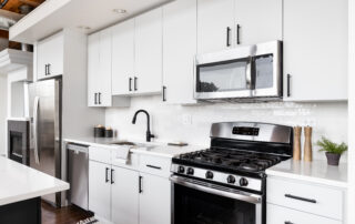
10 Creative Ideas for Cabinet Painting in Fairfield, CA
In the vibrant city of Fairfield, homeowners constantly seek ways to refresh and rejuvenate their living spaces. Regarding kitchen renovations, cabinet painting is a cost-effective and stylish solution to breathe new life into the heart of the home. With many colors, finishes, and techniques available, the possibilities for cabinet [...]

7 Fantastic Benefits of Professional Pressure Washing Services
When it comes to maintaining the exterior of your home, the transformative power of professional pressure washing services cannot be overstated. The advantages are plentiful, from rejuvenating your property's appearance to protecting it from potential damage. In this blog, we'll explore the myriad benefits of hiring experts in pressure washing, [...]
8 Indicators That You Need Cabinet Repainting
If your kitchen cabinets have seen better days, showing signs of wear and tear, it might be time to give them a fresh look. This blog post will delve into six unmistakable signs that indicate your cabinets need a repaint. Repainting revitalizes your kitchen's appearance and extends your cabinets' [...]
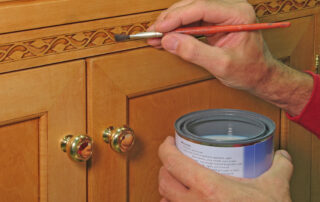
5 Dos and Don’ts of Cabinet Painting
When painting cabinets, achieving a professional and durable finish requires careful planning and execution. Whether tackling a DIY project or hiring professionals, understanding the dos and don'ts of cabinet painting is essential for a successful outcome. In this blog, we'll cover every step from preparation to finishing touches, ensuring [...]

10 Effective Maintenance Tips for Interior Painting
Investing in a fresh interior paint job can instantly rejuvenate your living spaces, providing a burst of color and a renewed sense of style. Proper maintenance is key to ensure that your interior paint maintains its vibrancy and finish over time. In this guide, we'll explore maintenance tips designed [...]

How to Pick the Best Paint Finish for Each Room
Selecting the perfect paint finish isn't just about aesthetics; it's about creating a harmonious blend of style, durability, and functionality for each room in your home. Let's embark on a room-centric odyssey, exploring the diverse world of paint finishes to make informed decisions that elevate your spaces' appearance and [...]